Yokoy Travel Expense Management
Yokoy provides spend-management solutions for medium to enterprise-level organisations.
The Travel Expense module is a core part of the original product and over the years different issues were identified. I was tasked with leading the re-design of the module to tackle the user experience issues identified and increase the product’s NPS.
Company
Yokoy
Year
2023
Responsibilities
Research,
Product Design
Overview
The Travel Expense module in Yokoy allows for simplified expense management by allowing users to combine all business trip expenses into a single expense report for streamlined processing.
User experience issues were identified in through user feedback and user testing sessions. These issues were negatively impacting user activation and perception of Yokoy as a complete spend-management solution.
Role and Responsibilities
Research: Reviewed customer support tickets and conducted usability testing with customers and prospects to identify user pain points.
Strategy and Collaboration: Prioritized user needs, ran an impact/effort analysis and defined a release a strategy in collaboration with the product manager and engineering team.
Execution: Designed solutions to address the identified user pain points, tested these with external and internal users and defined specifications for the engineering team.
Key challenges & solutions
Trip itinerary creation errors
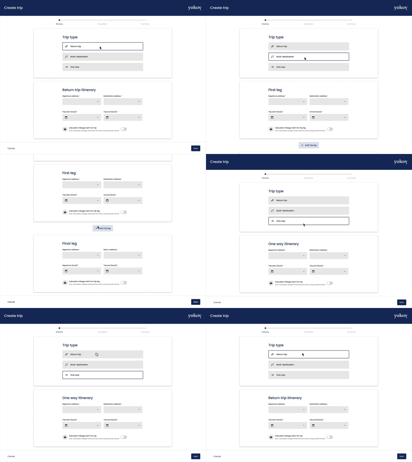
Challenge: Due to the flexibility of the existing Trip creation form and a one-size-fits-all approach, users were confused when creating simple return trips, forgetting to indicate the return location or duplicating the destination, leading to errors and approval delays.
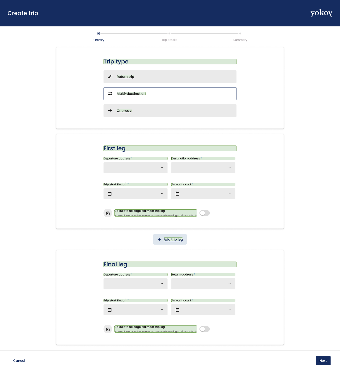
Solution: By asking what type of trip the user wants to create, the form is tailored to only ask the essential information for each scenario and allowing automation of data input, reducing time-on-task and mitigating errors.
Unclear terminology
Challenge: Some terminology used in the Trip creation form wasn’t clear to users, e.g. ‘Stop’ meant an intermediate destination, but users assumed it refered to train or airport transfers. Actions for auto-creation of mileage or daily allowance claims were also the source of confusion.
Solution: Involved a UX writer to collaborate on the updating of the copy used in the Trip creation form, tested with users to choose the most voted labels.
Reviewing trip expenses
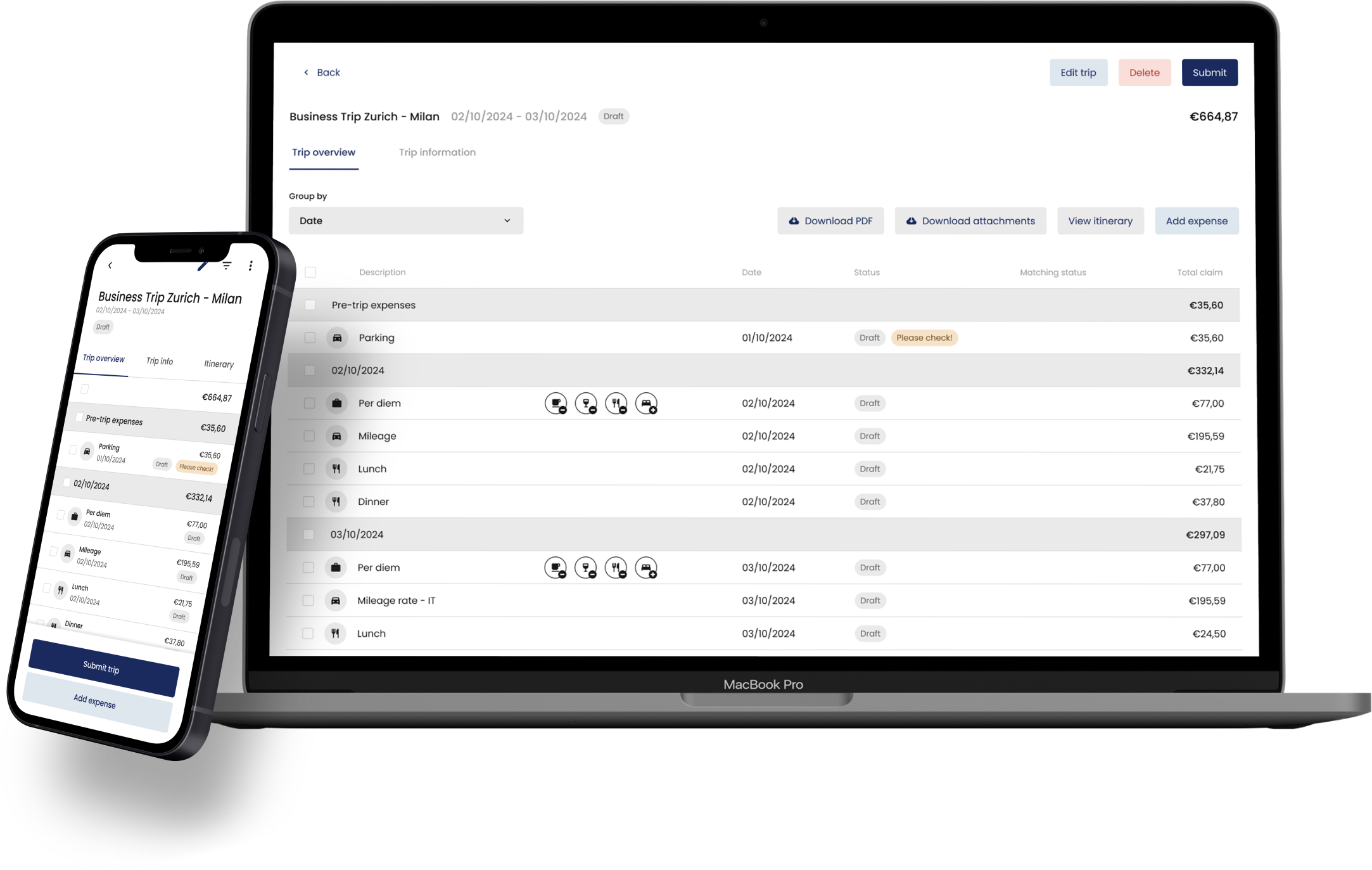
Challenge: The previous solution displayed the expense report in a small modal leading to issues of scalability. It was also hard to quickly glance and identify which expenses had been reviewed as there was no visible status in the overview. When sending an expense back for review, admins would need to send the whole report back and loose track of completed reviews.
Solution: Designed a trip overview page with expenses grouped by date, the type of expense cleary identified, and ability to approve/send back individual expenses or the complete report.
Outcomes and Impact
Reduced time in the trips approval workflow, due to reduced number of creation errors.
Enhanced customer satisfaction of admins and accountants due to a streamlined trip expense report screen.
Generated interaction patterns that could be re-used in other parts of the application, contributing to a consistent user experience.
Learnings
Validating user feedback with moderated user testing is key to uncover the real reasons behind a user pain point as well as other potentially connected issues.
Testing with existing users and prospects gives a better picture of the usability issues of a product. Only testing with existing users has a bias of its own that can be managed this way.
Very flexible UIs can create confusion for users trying to complete the most common task. Design first for the most common use case and cover secondary use cases without impacting the experience of the former.


